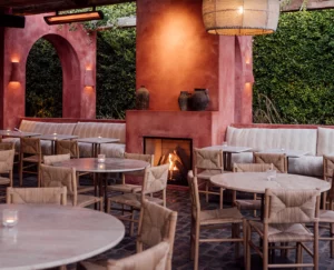
There's an all-day cafe style that's taken over Los Angeles in the past few years, and we can't get enough of it. While some of LA's most celebrated restaurants are highly exclusive and nearly invisible from the street, this new breed of hotspot is designed to spill right out onto the sidewalk.
Since it opened in 2017, Great White in Venice has nailed the charming, but sexy aesthetic that defines the all-day cafe genre, and we're thrilled to see the brand expand across the city.
We spoke with Great White co-founder and creative director, Sam Cooper to ask a bit about his philosophy on food, design, and their buzzy new Melrose location. The cafe is an instant hit here, nestled next to Gracias Madre among West Hollywood's most trending brand storefronts and restaurants. It's stunning façade is wrapped in a deep coral shade that matches Cooper's childhood home in Australia.
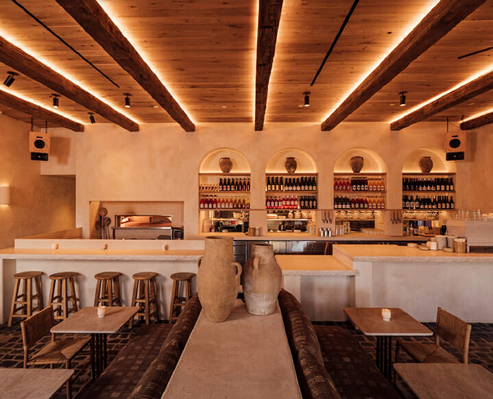
Great White in a nutshell: We wanted to create a casual all-day concept that serves fresh produce prepared with thoughtful simplicity, and delivered in an easy-going, casual, and friendly way. Our menu is helmed by Chilean chef Juan Ferreiro (formerly of Per Se).We are a restaurant for all times of day, all days of the week — the kind of place where great coffee bleeds into lunch with a glass of wine in the afternoon and then dinner. The community and focus on conversation, and sharing experiences through great, yet simple food—never too dressed up but not too casual either—is very important to us.
the Great White aesthetic in 3 words: Coastal, textured, casual.
the perfect order from the Great White menu: For dinner, I really like to start with our Citrus and Burrata and our Mushroom Fries followed by the Crispy Fish. I am really proud of our rotating natural wine program and will typically have a glass of orange or red.
influences that inform the Great White look and feel: We designed and built each of the restaurants from scratch and were really influenced by travel and places that inspire us around the world and a blend of different coastal cultures coming together.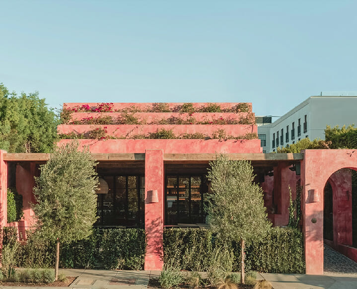 Much of the aesthetic influence comes from coastal regions with plastered walls, soft woods, clay wall lights and our artwork. The new Melrose location continues to reflect that sensibility, but with a West Hollywood twist. It has a large outdoor patio with twin fireplaces and reclaimed cobblestone flooring from Germany. The doors that open onto it are custom… everything just has its own unique twist whilst still aligning with the other venues. It’s important for the space to work just as well for breakfast as it does for dinner, which is one of the design challenges we faced. The aesthetic has to work for all phases of the day.
Great White feels very Los Angeles – what elements do you think give it such a local feeling? L.A. is such a patchwork of different neighborhoods and communities, and every location breathes new life into our brand. It is so important to reflect the local community in each of our spaces so that they are distinctly their own, whilst all retaining the same casual, coastal-inspired sensibility that Great White has become known for. It is a design challenge we relish with each new location!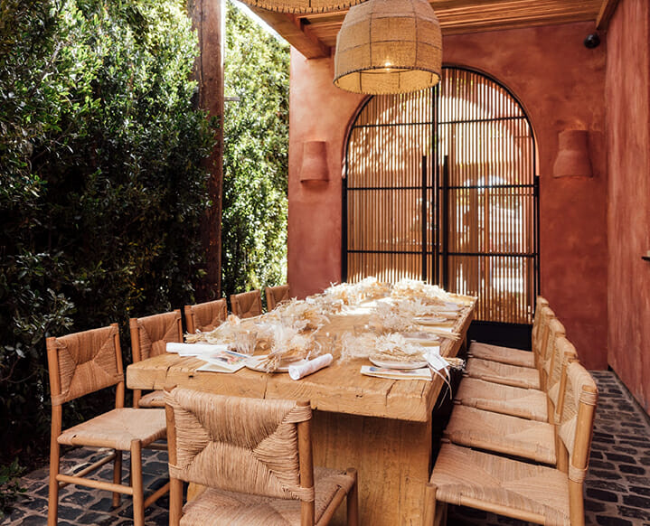 Each of our restaurants is designed to blend the indoor and outdoor dining areas and to be visible from the street, this was intentionally developed to create an instant relationship with the neighborhood. We feel this emphasis on inclusivity and community in all our locations — something that is very present in our favorite cafes in Australia and Europe.
i'm obsessed with the sconces throughout the cafes. Can you tell us more about them? We designed them with a ceramicist in Malibu that we met whilst surfing! Each one is made by hand and a riff on the type of clay sconces you might find in traditional buildings in Greece and Italy. We went through multiple different prototypes to find the perfect ones.
on sustainable design: Much of the wood used in the new location is repurposed from a 100-year-old barn in Idaho and the patio flooring is 150-year-old reclaimed cobblestone from Germany. We wanted a timeless feel and to work with recycled materials to give the overall design a feeling like it’s been there forever. There is no plastic anywhere in the design. Our Melrose location is our first to have a private dining room, but it is actually outside, so guests get all the benefits of fresh air but still with the intimacy and privacy of a standalone space.
favorite Melrose neighbors: Byredo, Acne, Madhappy, and Palace are all right across the street from us. We have created close relationships with their teams. I love the design of their stores, their products, and the great people that work there.
3 of your favorite design inspirations: Olive Ateliers, Pat McGann gallery and Eco Outdoor.
 What is next for the Great White brand? We’ve been focused on opening our Melrose location and are so happy with how the community has embraced us. We have recently signed other new exciting locations which we’ll be able to talk about soon. There are so many great cultural influences that permeate our current menus, and we are really looking forward to exploring this even further with our new ventures.
The post Inside Great White Melrose: On Orange Wine And Mushroom Fries appeared first on The Chalkboard.
from The Chalkboard https://ift.tt/cuAOv92
via IFTTT
No comments:
Post a Comment