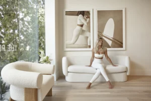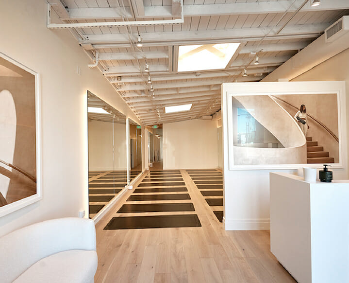
Natasha Oakley and Jacqui Kingswell are the co-founders of The Pilates Class, a wellness concept with a new studio here in West Hollywood. What first caught our attention about TPC Studio was the stunning, minimal design. A stunning spiral staircase hangs in a photo framed above the front desk and other architectural photography framed throughout the space make the tiny studio feel as though its packed with these timely features in real life. A great design hack for studios and offices at home!
We asked designer Dave Corbin of Studio Corbeau to tell us about his process working on The Pilates Class space that Tash and Jacqui wanted to feel minimal and neutral with a ‘quiet luxury’ look.
My design aesthetic in brief: Although we work in many styles, I would describe our aesthetic as warm, natural and modern. We love creating spaces that are uncluttered, where things have space around them—although I wouldn’t call us minimalists. We love materials that are natural and not overly worked, like unfinished woods and metals, stone, and ceramics. We generally work in textured neutrals with color being introduced in elements such as stone, tile and art.
How we approached The Pilates Class studio design goals: We are a conduit for bringing our client’s vision to life. It’s something I think we are particularly good at. We listen well and work to create the best possible iteration of their vision. In this case, their design goal was to create a warm, simple and peaceful space. Where people feel relaxed, comfortable, and a bit pampered. A safe space where clients feel comfortable, at-ease, and right at home.
The final TPC aesthetic in brief: Warm, minimal, natural, and texturally rich.
The color palette is simple, but the space feels warm. What are your tips for achieving that at home? When using a very simple palette, let texture work for you. Layer neutral hues in varied textures to create richness and interest. And, add personal touches. TPC used their own images rather than other art. At home, use art you collect or create, small pieces you’ve found when traveling, family photos, and things handed down to you to make the space feel interesting, personal and complete. Second-hand art books are another great way to add history and beauty to complete any space.
Most importantly: lighting! Good, warm lighting is key to making any space great. Look at the color temperature of your lightbulbs. Use warm color temperatures 2700-3000K to provide light that emulates candlelight. This will make everything feel warm and inviting. And dimmers on everything you possibly can, and use them. As outdoor lighting levels go down, dim your lights. Everything will glow and feel beautiful. It’s even good for your health and sleep patterns to have warmer natural lighting as the sun goes down.
Favorite element in the project: The open ceiling with exposed structure adds a lot of interest in this space. I also love the wide-plank white oak floors and warm lighting.
What challenges did you face with a space intended for many workouts? Making sure there aren’t many fixed elements in the workout spaces was important in order to keep the space flexible. In addition, designing storage was important to ensure the space stays uncluttered.
Design trend you love: We don’t really think in terms of trends. There are trends that I see and like but not because they are trends. When I see a trend I like, it’s usually a timeless material or element that is having a moment. Certain metals, like brass for example, have been big trends at times, but brass is actually a classic material regardless of its popularity at a given time. We don’t pay much attention to trends and prefer design ideas that are timeless.
Trend you can't wait to be over: There are many trends that I’d love to have end. The trends I like the least are ones that tend to be driven by industries and contractors pushing them. Faux materials that try to replicate nature is a trend I particularly dislike. Some manufactured stone, for example, may have a place in certain projects, but I prefer natural stone. No one can design better than nature. I prefer steel or wood windows in residences, rather than vinyl or other manufactured materials. The real things can be more expensive, but if you can afford it, use it.
Natural materials may require a little more care, but they can last for hundreds of years if cared for properly. They are much more beautiful and authentic. Part of using natural materials is understanding and accepting that they will patina and develop character over time. Materials don’t have to be perfect and stay looking like they are brand new. Patina adds character, warmth, and a sense of history.
Favorite design shopping destinations in L.A.: There are so many. A few that spring to mind are:
+ JF Chen
+ Lawson-Fenning
+ Croft House
+ Big Daddy’s Antiques
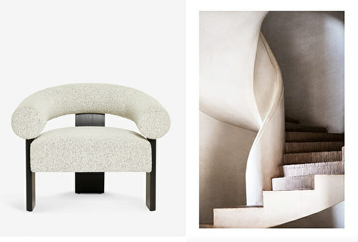
get the look: Check out Lulu and Georgia's boucle Celeste Accent Chair and Desensio's Stairs of Art No 1 Poster
The post Inside the Design: Why We Love The Pilates Class Gorgeous L.A. Studio appeared first on The Chalkboard.
from The Chalkboard https://ift.tt/kMybwfl
via IFTTT
No comments:
Post a Comment